Showing posts with label typography. Show all posts

Shaped Poetry

New Year, I should get back on this like a mother.

Time I wrap up the Nashville trip in the fall huh?

One of the really cool things I got to see in Nashville was this exhibit in their awesome public library. That building was gorgeous, well used, and provided such a great community gathering place including exhibits such as Shaped Poetry. The Shaped Poetry Exhibit consists of 30 typographic prints from the book which is each on a different handmade paper in a wide range of typefaces and in a variety of colors.

Le swoon.

These prints are concrete forms throughout history and have some of my favorite concrete poems. I love concrete poems since I was introduced to them in AP English back in last year of high school. It was the first time ever that something clicked for me in English class. Being an artsy kid, I sure thought English class was hard since I just didn’t “get it.” But with concrete poems, it was like seeing words through artsy eyes and I feel in love with reading poems thanks to Ms. Savage’s introduction that year. Ms. Savage was awesome, she was also the one who taught me how to stand and walk in 4-inch heels, which led to my path of getting out of tomboyism finally. And I think these poems led me down a path of loving design/words/typography.

Back to the exhibit, below are some of my favorites from the exhibits.


Here's the Arion Press site about the book. I just need about $3000.00 to have this book and have my own version of this exhibit.

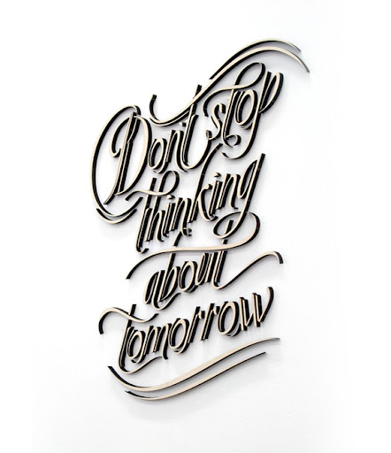
Fleetwood Mac


I used to listen to a lot of Fleetwood Mac about 15 years ago. Ah nostalgia.

(via impress on me)

The connection


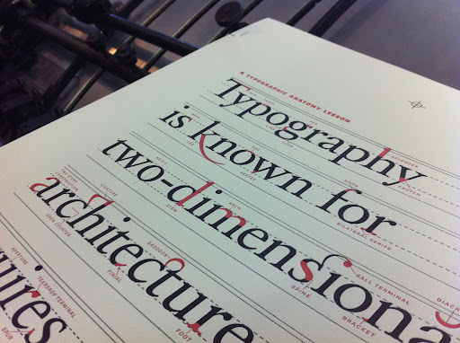
Typography is known for two-dimensional architecture.

(via impress on me)

Summertime

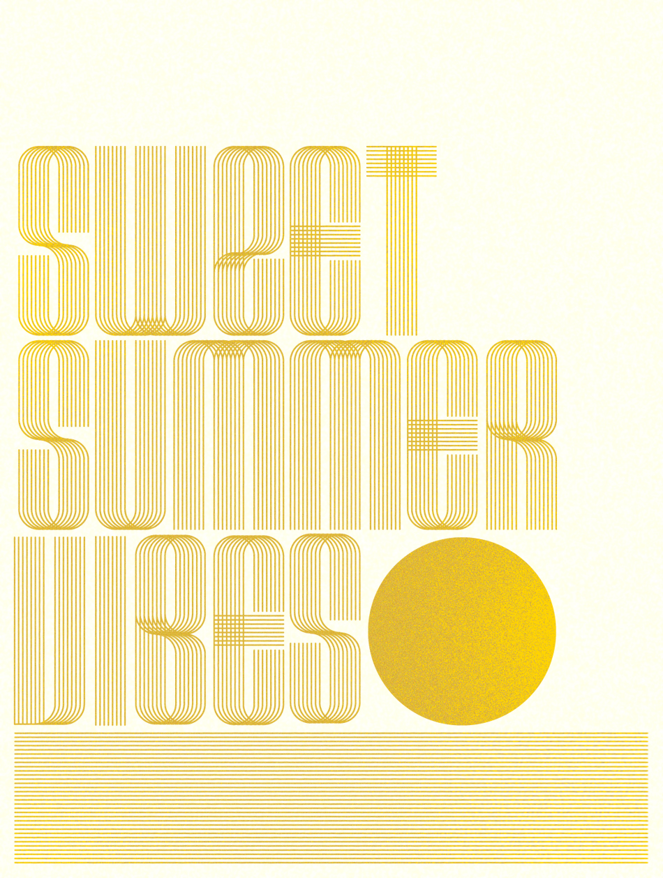
We are seeing record highs here this summer. These cool prints by Richard Perez at Friends of Type reminds me of why I like summer instead of complaining about waiting for the sun goes down so I can skate on blacktops under the stars.


Exactly my thought.

Typographic puzzles


Another reason to have kids...to force my typophile agenda onto somebody at a young age.


Nuzzles®
by John Christenson

Nuzzles® are custom designed handmade wooden name puzzles, each with its own unique typographic style. Every puzzle is crafted from a single block of wood, and the letterforms interlock with each other in a way that creates a sense of harmony and integrity.

images via behance

This Book is Awesome


Have you seen this book?


Because it is awesome.

It covers everything from signage, product labels to comics. Excellent for flipping through to find the right element or font. A great reference book and very inspirational.

Look, it's even got a poster of one of my fav bands (The Cramps)!


Table, Literally

Found: Furniture to go into my future concept pho restaurant "Pho Sho."


By: Toshinori Kamiya

via: Spoon & Tamango

Geek Crush: Shakespeare Sonnets + Typography


Here is a typography project based on annalyzing and generating patterns from Shakespeare's sonnets. I just love the patterns and overlaps of the outcome. It's like words that have been turned into a beautiful quilt.


The Process

Click on any of the images to Stian Ward Bugten's project site.

Tipped from Ok Great!

Don't hate the Papyrus, hate the game

I didn't just watch Helvetica (2007), I watched the shit out of it while others snored away on the couch. I love typography and handwriting. I feel that typography really impacts the delivery of the message and I just can't take people seriously when they use 18pt purple script fonts in emails or mixing a bunch of fonts so I think I'm reading a ransom note. I don't think there is one font that should just be obliterated from our planet because even the most hated Papyrus looks friggin rad on a simple note card.


Just please don't use it on examples like these from Your Logo Makes Me Barf, where I get my "inspirations" of what NOT to do.

Now for something incredibly beautiful I call typ0rnography I came across a site that had all these ol letterpress fonts in alphabetical order. I have a feeling my kids will be learning their ABCs as in A is for Arial, B as in Bank Gothic, C for Century…


Moral of the story: Good font usage is like a soundtrack to a movie. You do not use Benny Hill theme music during the puppy death scene just like you do not use Papyrus all over a SciFi movie (yeah James Cameron, why did you wreck the previews of Avatar), and you don't use the Goosebumps font for kickass movie like 9 (et tu Tim Burton, ye of wonderful taste?).


And let's blow up Comic Sans, that's the font I really think should be obliterated for-evar!


Sidebar: So confused, why are there two Nine/9 movies coming out this year?